The impact of font style
Posted by: David Hall
So what effect does font style have on people’s evaluation of the message conveyed in the writing?
In Brainfluence, Roger Dooley’s landmark book on neuromarketing, he cites research by Hyunjin Song and Norbert Schwarz on the impact font style has on the way we perceive information. In 2008, they published a paper in the journal Psychological Science titled, “If it’s hard to read, it’s hard to do.” The paper cites three separate studies. Let’s look at two of them.
 In the first study, they gave instructions for completing an exercise to two groups of people. (See the instructions on the right.) One group received the instructions in the Arial font.
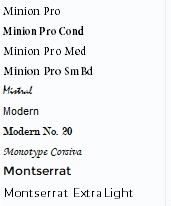
 The other group received the instructions in Monotype Corsiva font.
They then asked all the study subjects to estimate the amount of time it would take to complete the exercise and they averaged the estimates of each group.
Results? People who read the instructions in the easy-to-read Arial font estimated that the exercise would take 8.2 minutes. People who read the instructions in the harder-to-read Monotype Corsiva font estimated that the exercise would take 15.1 minutes, almost twice as long.
In their second study, they gave subjects a recipe for a Japanese lunch roll and asked them to evaluate how much time and skill it would take to prepare the recipe. When the recipe was presented in the elegant but difficult-to-read Mistral font, they assumed that it would require more time and skill than when it was given to them in the easy-to-read Arial font.
Font Psychology
There has been a lot written about font psychology, and there have been studies examining subtleties of the impact of various fonts on the feelings created by our writing. But even without the studies, we can tune into our own feelings and easily see the emotional impact of these font styles. Here are descriptions of these font styles, from Gert Svaiko of Designmodo:
Serif Fonts
- Traditional
- Respectable
- Reliable
- Elegant
- Sophisticated
 Sans-Serif Fonts
- Clean-looking
- Clarity
- Modern
- Efficient
- Straightforwardness
Script Fonts
- Elegance
- Creativity
- Uniqueness
- Personal
- Emotional
Decorative Fonts (can create various feelings)
- Casual
- Creative
- Original
- Flexible
- Urban
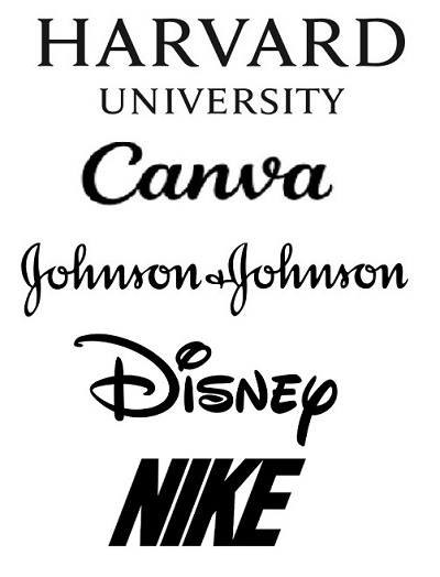
Now, look at the font styles above from well-known brands and try to sense the feelings being created.
And while in the vast majority of cases you want a font that is easy to read, Song and Schwarz even state that there may be cases where a difficult-to-read font may be the appropriate branding:
Hence, it may be advantageous for restaurants to describe their dishes in a difficult-to-read font, which conveys that their preparation requires considerable skill and effort – but the same font may discourage the hobby cook from trying the recipe at home.
Indeed, there are some elegant restaurants that employ this technique, in order to brand themselves as providing elegant meals that require exquisite preparation.
Conclusion
To fully tune the branding of a website, attention needs to be paid to the impact of typography.
Great info and so important. Many people want to use a particular font because it looks nice without realizing the consequences.
Very interesting. It might help to have a “Font Personality Profile” tool that can help us to know which font we most closely identify with.
Well.. looks like someone already created one.
https://www.buzzfeed.com/addiecraighead/what-font-are-you
Turns out I’m a “Black Mango” font